When a customer sees a brand for the first time, colours influence their decision before they even read a single word. The human brain processes visual information in milliseconds, making colour one of the most immediate factors in how people perceive products and companies.

Strategic colour choices can increase brand recognition by up to 80% and directly impact purchasing decisions through psychological triggers that tap into emotions and cultural associations. Marketers who understand these principles gain a powerful tool for connecting with their target audience on a subconscious level.
This comprehensive guide explores how colour psychology shapes consumer behaviour, from building trust through strategic brand identity to optimising marketing materials for maximum impact. Readers will discover practical strategies for colour selection, learn about cultural considerations that affect global campaigns, and understand how proper colour use enhances both accessibility and brand loyalty across different market segments.
Understanding Colour Psychology in Marketing

Colour psychology examines how different colours trigger specific emotional responses and drive consumer actions. Research shows that colour influences 85% of purchase decisions, making it a critical tool for marketers to shape brand perception and increase sales.
Defining Colour Psychology and Its Significance
Colour psychology is the study of how colours affect human emotions, behaviour, and decision-making processes. It explores the connection between visual stimuli and psychological responses.
In marketing, this field helps businesses understand which colours create desired emotional reactions in consumers. Different colours can make people feel calm, excited, trustworthy, or motivated to take action.
The significance of colour psychology lies in its ability to communicate without words. A single colour can convey brand values, product benefits, and emotional messages instantly.
Key applications include:
- Brand identity development
- Website design and user experience
- Product packaging and advertising
- Call-to-action buttons and marketing materials
Studies demonstrate that the right colour choices can boost brand recognition by up to 80%. This makes colour selection a strategic business decision rather than just an aesthetic choice.
Marketers use colour psychology to create stronger connections with target audiences. The approach helps brands stand out in competitive markets and influence purchasing behaviour effectively.
Psychology of Colour: Emotional and Behavioural Impact
Different colours trigger distinct emotional responses in the human brain. These reactions happen automatically and influence how people perceive brands and products.
Red creates feelings of urgency, excitement, and passion. It increases heart rate and can stimulate quick decision-making. Many brands use red for sale announcements and clearance events.
Blue builds trust, reliability, and calmness. It reduces stress and creates professional associations. Financial institutions and healthcare companies frequently choose blue for their branding.
Green represents growth, nature, and wealth. It creates balanced emotions and suggests environmental responsibility. Many eco-friendly brands and financial services use green effectively.
Yellow generates happiness, optimism, and energy. It grabs attention quickly but can cause anxiety if overused. Food brands often incorporate yellow to stimulate appetite.
Orange combines red’s energy with yellow’s happiness. It creates feelings of enthusiasm and creativity whilst encouraging action.
Purple suggests luxury, creativity, and sophistication. It appeals to premium markets and artistic audiences.
Black conveys elegance, power, and authority. Luxury brands use black to create exclusive, high-end perceptions.
The Influence of Colour on Consumer Behaviour
Colour directly impacts how consumers interact with brands and make purchasing decisions. The right colour choices can increase conversion rates, improve brand recall, and drive customer loyalty.
Purchase Decision Making Colour influences buying behaviour through subconscious associations. Consumers form impressions within 90 seconds of seeing a product, with colour accounting for 62-90% of that assessment.
Brand Recognition Consistent colour use increases brand recognition by 80%. Consumers learn to associate specific colours with particular brands, creating instant identification in crowded marketplaces.
Website Performance Call-to-action buttons in contrasting colours can improve click-through rates by 21%. Red and orange buttons typically perform better for urgent actions, whilst blue works well for trust-based decisions.
Cultural Considerations Consumer behaviour varies across cultures and demographics. White represents purity in Western cultures but mourning in some Eastern cultures. Age groups also respond differently to colour schemes.
Shopping Environment Retail spaces use colour psychology to guide customer behaviour. Warm colours create intimate environments that encourage browsing, whilst cool colours suggest efficiency and quick transactions.
The Role of Colour in Branding and Visual Identity
Colour serves as a fundamental building block for creating distinctive brand identities that consumers can instantly recognise and connect with emotionally. Strategic colour choices help establish brand personality while ensuring consistent visual communication across all brand touchpoints.
Establishing Brand Identity Through Colour
Brand identity begins with deliberate colour choices that reflect a company’s core values and mission. Each colour carries specific psychological associations that shape how consumers perceive a brand.
Red communicates energy and urgency, making it popular with food and retail brands. Blue suggests trust and reliability, which explains its widespread use in financial services. Green represents growth and nature, appealing to environmentally conscious consumers.
Companies must select colours that align with their industry and target audience. A luxury brand might choose black and gold to convey sophistication. A children’s toy company would likely opt for bright, playful colours like yellow and orange.
The chosen colour palette becomes the foundation for all visual identity elements. This includes logos, packaging, websites, and marketing materials. These colours help differentiate the brand from competitors whilst creating emotional connections with customers.
Building Brand Recognition with Consistent Colour Use
Consistent colour use across all brand materials increases recognition by up to 80%. When customers see the same colours repeatedly, they begin to associate those specific hues with the brand.
McDonald’s golden arches demonstrate this principle perfectly. The bright red and yellow combination appears on every restaurant sign, food packaging, and advertisement. This consistency helps customers spot McDonald’s from great distances.
Digital platforms require the same colour consistency as physical materials. Websites, social media profiles, and mobile apps should all feature the brand’s primary colour palette. This creates a seamless experience across different touchpoints.
Brand guidelines document exact colour codes for print and digital use. These specifications ensure that colours appear identical whether on business cards or billboards. Consistency builds trust and makes brands appear more professional and established.
Colour and Brand Personality Alignment
Brand personality traits must match the chosen colour combinations to create authentic connections with consumers. Colours communicate specific characteristics that influence brand perception.
Energetic brands use warm colours like red, orange, and yellow. These hues suggest excitement, enthusiasm, and action.
Professional brands favour cooler tones such as blue, grey, and white. These colours imply competence, stability, and trustworthiness.
Creative brands often employ vibrant, unexpected colour combinations. Purple, teal, and bright green can signal innovation and artistic thinking.
The alignment between colour choices and brand personality helps consumers understand what the company represents. Mismatched colours confuse customers and weaken brand messaging. A serious financial institution using bright pink would send conflicting signals about its reliability and professionalism.
Colour Selection Strategies for Effective Marketing

Smart colour choices require understanding your audience’s preferences and creating palettes that work across all brand touchpoints. Successful brands focus on research-backed colour decisions that align with their target market’s expectations and cultural background.
Assessing Target Audience Preferences
Market research reveals how different demographics respond to specific colours. Age groups show distinct preferences, with younger audiences often favouring bright, bold colours whilst older demographics prefer muted, sophisticated tones.
Gender influences colour perception significantly. Studies show women distinguish between colour variations more easily than men. This affects how brands should present their colour palettes.
Cultural background shapes colour meaning. Red symbolises luck in Chinese culture but danger in Western markets. Brands must research their target regions before finalising colour schemes.
Key demographic factors to consider:
- Age range
- Gender distribution
- Cultural background
- Income level
- Geographic location
Testing colour preferences through surveys and focus groups provides valuable data. A/B testing different colour combinations on websites and advertisements shows real performance differences.
Crafting a Cohesive Colour Palette
Brand colours must work together across all marketing materials. A cohesive colour palette typically includes 3-5 colours that complement each other.
Primary brand colours should dominate most marketing materials. These become the colours customers associate with your brand. Secondary colours support the primary ones and add variety.
Effective colour palette structure:
- Primary colour: 60% of design usage
- Secondary colour: 30% of design usage
- Accent colours: 10% of design usage
Colour combinations affect readability and user experience. High contrast between text and background colours improves accessibility. Dark text on light backgrounds generally performs better than reverse combinations.
Seasonal colour adjustments keep brands fresh whilst maintaining recognition. Fashion and retail brands often introduce seasonal accent colours whilst keeping core brand colours consistent.
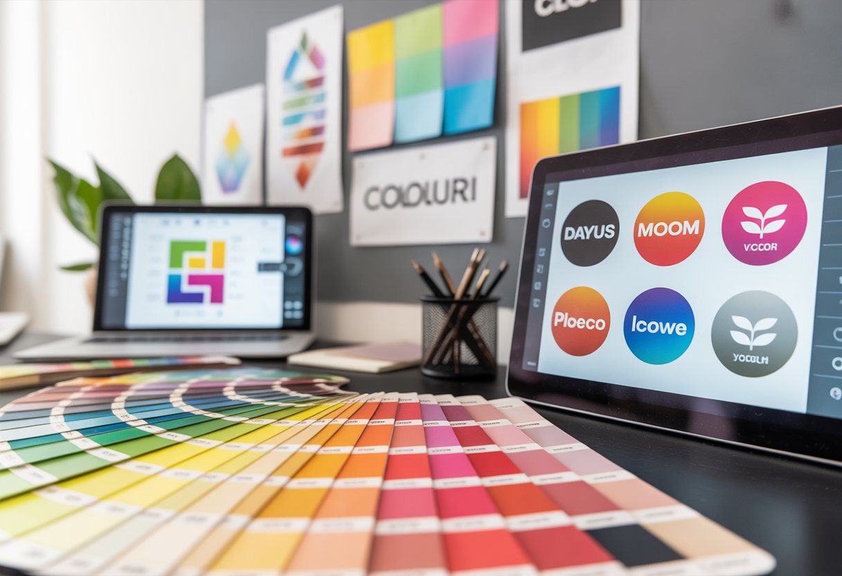
The Importance of Colour in Logo Design
Logo colours create immediate brand recognition. Studies show colour increases brand recognition by up to 80%. Customers remember coloured logos more easily than black and white versions.
Logo design must consider where the logo appears. Digital screens display colours differently than printed materials. Colours may look different on various devices and paper types.
Logo colour considerations:
- Scalability across different sizes
- Visibility on various backgrounds
- Print and digital compatibility
- Black and white versions
Simple colour schemes work better for logos. Complex colour combinations become difficult to reproduce consistently. Two to three colours maximum ensures flexibility across different applications.
Brand colours in logos should reflect company values and industry standards. Financial companies often choose blue for trust and stability. Environmental brands frequently select green to show their eco-friendly focus.
Practical Applications of Colour Psychology in Marketing Materials
Marketing professionals can apply colour psychology principles across various touchpoints to influence consumer behaviour and improve campaign performance. Strategic colour choices in advertising, marketing materials, and systematic testing help brands create stronger connections with their target audiences.
Enhancing Advertising with Colour Choices
Advertisers select colours based on the emotions they want to evoke and the actions they want consumers to take. Red creates urgency and excitement, making it effective for clearance sales and call-to-action buttons. Blue builds trust and reliability, which explains why financial services and healthcare brands frequently use it.
Orange and yellow grab attention and convey energy. Fast food chains often use these colours to stimulate appetite and encourage quick decisions. Green suggests health, nature, and growth, making it popular for organic products and environmental campaigns.
Colour contrast plays a crucial role in advertising effectiveness. High contrast between text and background improves readability. Light text on dark backgrounds or dark text on light backgrounds ensures the message stands out.
Seasonal colour choices can boost campaign relevance. Warm autumn tones work well for harvest-themed promotions. Cool winter blues and whites suit holiday campaigns.
Using Colour in Marketing Materials to Influence Decisions
Different marketing materials require specific colour strategies to guide consumer behaviour effectively.
Packaging design relies heavily on colour psychology. Premium products often use black, gold, or silver to convey luxury. Budget-friendly items typically feature bright, bold colours to suggest value and accessibility.
Website design uses colour to direct user actions. Converting visitors requires strategic placement of coloured elements:
| Colour | Common Use | Psychological Effect |
|---|---|---|
| Red | Buy buttons, sales tags | Creates urgency, drives action |
| Green | Sign-up forms, proceed buttons | Suggests safety, encourages progress |
| Blue | Information sections, trust badges | Builds confidence and credibility |
| Orange | Subscribe buttons, free trials | Generates enthusiasm and excitement |
Email marketing benefits from colour psychology in subject lines and content. Brands use colour-coded campaigns to segment audiences and create visual consistency across touchpoints.
Brochures and flyers employ colour hierarchies to guide readers through information. Important details receive bold, contrasting colours whilst supporting information uses softer tones.
A/B Testing for Colour Effectiveness
A/B testing reveals which colour choices produce better results across marketing materials. Companies test different colour variations to measure their impact on key metrics.
Button colour testing often shows significant differences in click-through rates. One company might find red buttons outperform blue ones by 15%, whilst another discovers the opposite based on their audience and context.
Email campaigns benefit from colour testing in headers, call-to-action buttons, and background elements. Marketers track open rates, click rates, and conversion rates to identify winning colour combinations.
Landing page testing examines how colour affects user behaviour. Tests might compare different background colours, form colours, or headline colours to see which versions drive more conversions.
Testing methodology requires proper sample sizes and statistical significance. Marketers run tests for adequate time periods to account for daily and weekly behaviour patterns. They test one colour element at a time to isolate variables and get clear results.
Regular colour testing helps brands stay current with changing preferences and market conditions.
Accessibility, Readability, and Cultural Considerations in Colour Use
Effective colour choices must balance psychological impact with practical accessibility needs and cultural sensitivity. Proper contrast ratios ensure all users can read content clearly, while understanding cultural colour meanings prevents misinterpretation across different markets.
Ensuring Readability and Accessibility in Design
Colour accessibility ensures that all users, including those with visual impairments, can access information effectively. Poor colour choices can exclude millions of potential customers from engaging with marketing materials.
Contrast ratios form the foundation of accessible design. Text must have sufficient contrast against its background to remain readable. The minimum contrast ratio for normal text is 4.5:1, while large text requires 3:1.
Colour blindness affects approximately 8% of men and 0.5% of women globally. Red-green colour blindness is most common, making certain colour combinations problematic for these users.
Designers should never rely solely on colour to convey important information. Additional visual cues such as icons, patterns, or text labels ensure all users receive the message clearly.
Testing colour combinations across different devices and lighting conditions helps identify potential readability issues. Bright sunlight can wash out colours that appear clear indoors.
Age-related vision changes affect contrast sensitivity. Older audiences may struggle with subtle colour differences that appear distinct to younger viewers.
The Impact of Cultural Context on Colour Interpretation
Colour psychology varies dramatically across cultures, making universal colour meanings nearly impossible to establish. What triggers positive emotions in one culture may create negative associations in another.
Red demonstrates these cultural differences clearly. Western cultures often associate red with passion, energy, or danger. However, in China, red symbolises good fortune, prosperity, and celebration.
White carries opposing meanings globally. Western cultures link white with purity, cleanliness, and weddings. Many Eastern cultures associate white with mourning, death, and funerals.
Religious contexts also influence colour interpretation. Green holds special significance in Islamic cultures, representing paradise and the Prophet Muhammad. Purple historically connected to royalty and spirituality across various religions.
Economic factors affect colour perception too. Luxury brands often use gold and black in wealthy markets, but these colours may seem inappropriate or inaccessible in developing economies.
Political associations can create unexpected negative responses. Certain colour combinations may remind audiences of political parties, flags, or historical events they prefer to avoid.
Colour Considerations for Global Audiences
Global marketing campaigns require careful colour strategy that works across multiple cultural contexts. Brands must balance universal appeal with local relevance to avoid costly mistakes.
Market research becomes essential when expanding internationally. Testing colour preferences with local focus groups reveals cultural blind spots that designers might miss.
Successful global brands often adapt their colour schemes regionally. McDonald’s uses green instead of red in some European countries to appear more environmentally conscious.
Digital platforms present additional challenges. Colour reproduction varies between devices, screens, and printing methods. What looks vibrant on a computer monitor may appear dull in print.
Seasonal considerations differ globally too. Orange and red work well for autumn campaigns in temperate climates but hold little relevance in tropical regions without distinct seasons.
Local competition influences colour choices as well. Dominant brands may have claimed certain colour territories, forcing newcomers to select alternative palettes to avoid confusion.
Multiple colour variants allow brands to maintain consistency while respecting local preferences. This approach requires additional design resources but prevents cultural missteps.
The Influence of Colour on Brand Loyalty and Perception
Colour psychology creates powerful connections between brands and consumers. Strategic colour choices build emotional bonds that increase customer loyalty whilst shaping how people view and remember brands.
Fostering Brand Loyalty Through Colour
Colour creates emotional connections that make customers return to brands again and again. When people see colours that make them feel good, they form positive memories about those brands.
Emotional bonding happens when colours match what customers want to feel. Red makes people excited and ready to act. Blue creates feelings of trust and calm. Green suggests health and nature.
Companies use the same colours everywhere to build recognition. McDonald’s golden arches work because yellow creates happy feelings. Customers link these good feelings with the brand.
Research shows that consistent colour use increases brand recognition by up to 80%. This happens because our brains remember colours faster than words or shapes.
Loyalty programmes often use specific colours to create special feelings. Purple suggests luxury and exclusivity. Gold makes people feel important and valued.
Colours also help customers make quick choices. When people feel confused by too many options, familiar brand colours guide their decisions. They pick brands with colours that feel safe and trusted.
Shaping Brand Perception with Strategic Colour Use
Colours tell customers what to expect from brands before they buy anything. Smart colour choices create the right first impression and build the brand image companies want.
Premium brands use black, gold, and silver to suggest high quality and luxury. These colours make products seem more expensive and exclusive. Customers expect better quality when they see these colours.
Health and wellness brands choose green and white to suggest cleanliness and natural ingredients. These colours make people think about fresh food and healthy living.
Different industries use colour patterns that customers expect:
| Industry | Common Colours | Message |
|---|---|---|
| Technology | Blue, grey, white | Trust, innovation |
| Food | Red, yellow, orange | Appetite, energy |
| Finance | Blue, green | Stability, growth |
| Healthcare | Blue, white, green | Clean, safe, caring |
Cultural differences matter when brands sell in different countries. White means purity in Western countries but represents mourning in some Asian cultures.
Colour combinations also change how people see brands. Too many bright colours can make brands look cheap or confusing. Simple colour schemes with two or three colours work best for building strong brand perception.
Frequently Asked Questions
Colour psychology raises many questions about how hues affect buying decisions and brand success. These answers address specific concerns about consumer behaviour, brand design, conversion rates, retail spaces, cultural differences, and testing methods.
How does colour influence consumer perception in advertising?
Colour affects 85% of purchase decisions by triggering emotional responses before consumers read any text. Red creates urgency and excitement, making it effective for sale advertisements and clearance promotions.
Blue builds trust and reliability, which explains why financial institutions and healthcare brands favour this colour. Green suggests growth and health, making it popular for organic products and environmental campaigns.
Bright colours like orange and yellow capture attention quickly in crowded advertising spaces. These colours work well for call-to-action buttons and promotional banners.
Consumers process colour information faster than text, making colour choice critical for first impressions. The wrong colour can create negative associations that override positive messaging.
What is the significance of different colours in brand identity design?
Brand colours become mental shortcuts that help consumers identify companies instantly. McDonald’s golden arches and Coca-Cola’s red create immediate brand recognition without needing to see the company name.
Purple conveys luxury and premium quality, which is why brands like Cadbury and Hallmark use this colour. Black suggests sophistication and exclusivity, making it popular for high-end fashion and technology brands.
Consistent colour usage across all brand materials increases brand recognition by up to 80%. This includes websites, packaging, advertisements, and physical locations.
Multiple colours can work together to communicate complex brand messages. For example, combining blue and green can suggest both trustworthiness and environmental responsibility.
How can colour psychology improve conversions in digital marketing campaigns?
Red call-to-action buttons often outperform other colours because red creates a sense of urgency. This colour encourages immediate action from website visitors.
Orange buttons also drive high conversion rates by combining the energy of red with the friendliness of yellow. This colour appears approachable while still prompting action.
Background colours affect how users perceive button colours and text readability. High contrast between elements makes it easier for users to find and click important buttons.
Email marketing campaigns see higher open rates when subject lines and sender names use colours that stand out in crowded inboxes. However, this varies by email client and display settings.
What are the psychological effects of colour in retail environments?
Warm colours like red and orange encourage quick decisions and impulse purchases. Fast-food restaurants use these colours to increase turnover and create energy.
Cool colours like blue and green promote calm browsing and longer shopping sessions. Clothing stores and bookshops often use these colours to encourage extended visits.
Bright lighting with neutral colours makes products appear more vibrant and appealing. This technique helps customers see true product colours and reduces returns.
Colour placement affects customer flow through stores. Bright colours near entrances draw people in, while calming colours in checkout areas reduce purchase anxiety.
How do cultural differences impact the perception of colour in global marketing?
White represents purity in Western cultures but symbolises mourning in some Asian cultures. Global brands must research colour meanings before expanding into new markets.
Red means good fortune in China but can signify danger in Western countries. This difference affects how promotional materials and packaging are designed for different regions.
Green represents nature and health in most cultures, making it relatively safe for global campaigns. However, the specific shade matters, as some greens have negative associations in certain cultures.
Companies often adapt their colour schemes for different markets while maintaining core brand recognition. This approach respects local preferences whilst preserving brand identity.
What are the best practices for A/B testing colour schemes in marketing materials?
Test only one colour element at a time to identify which specific change affects performance. Testing multiple colour changes simultaneously makes it impossible to determine which element drove results.
Run tests for at least one full business cycle to account for day-of-week variations in customer behaviour. Short tests may not capture enough data for reliable conclusions.
Test with sufficient sample sizes to ensure statistical significance. Small sample sizes can lead to false conclusions about colour effectiveness.
Document colour codes and specifications for winning variations to ensure consistent implementation across all materials. This prevents colour variations that could affect performance.
Looking for Branded Merchandise for your next marketing campaign?
Call us on 0151 650 6969
Or use our Contact Form